
The Vance brand was represented via a distinct color palette and a variety of images each corresponding with a specific service offering.
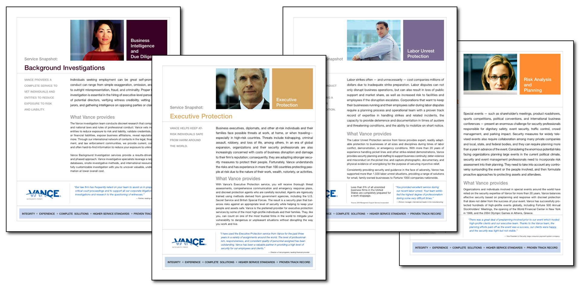
Service Snapshots all followed the same basic template, but used unique colors and images to visually differentiates the multitude of services.
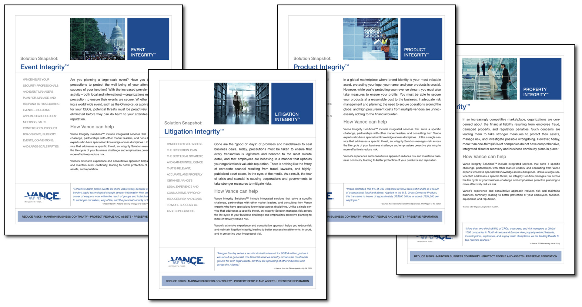
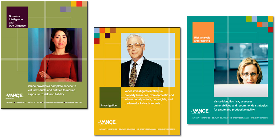
Solution Snapshots represented Vance’s highest level offering, and had a closer tie to the corporate brand.
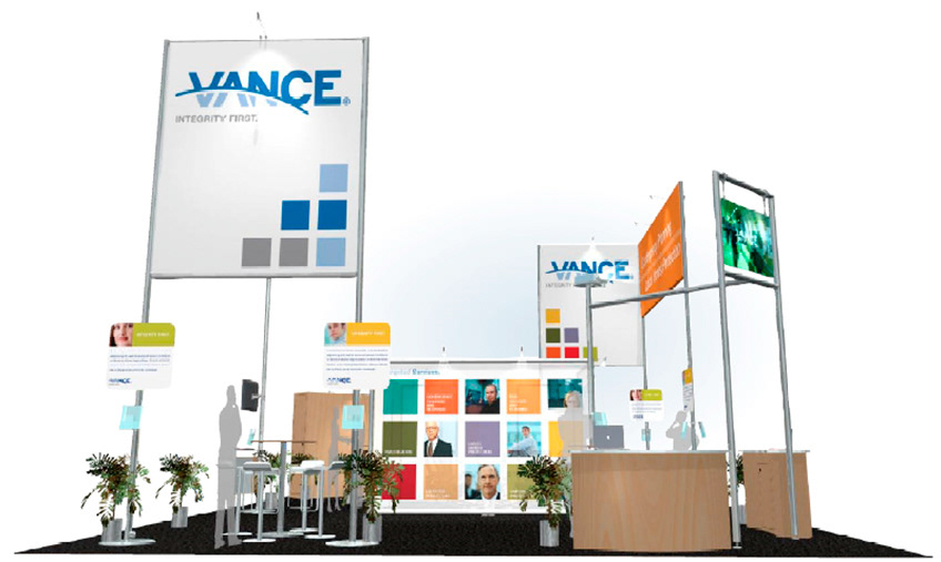
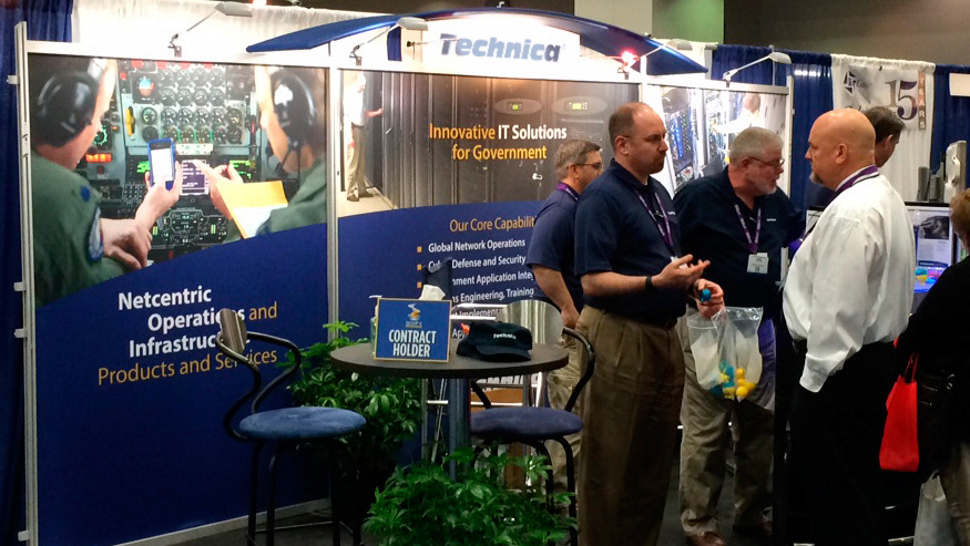
I worked with the branding company to apply the new look and feel to the tradeshow booth.
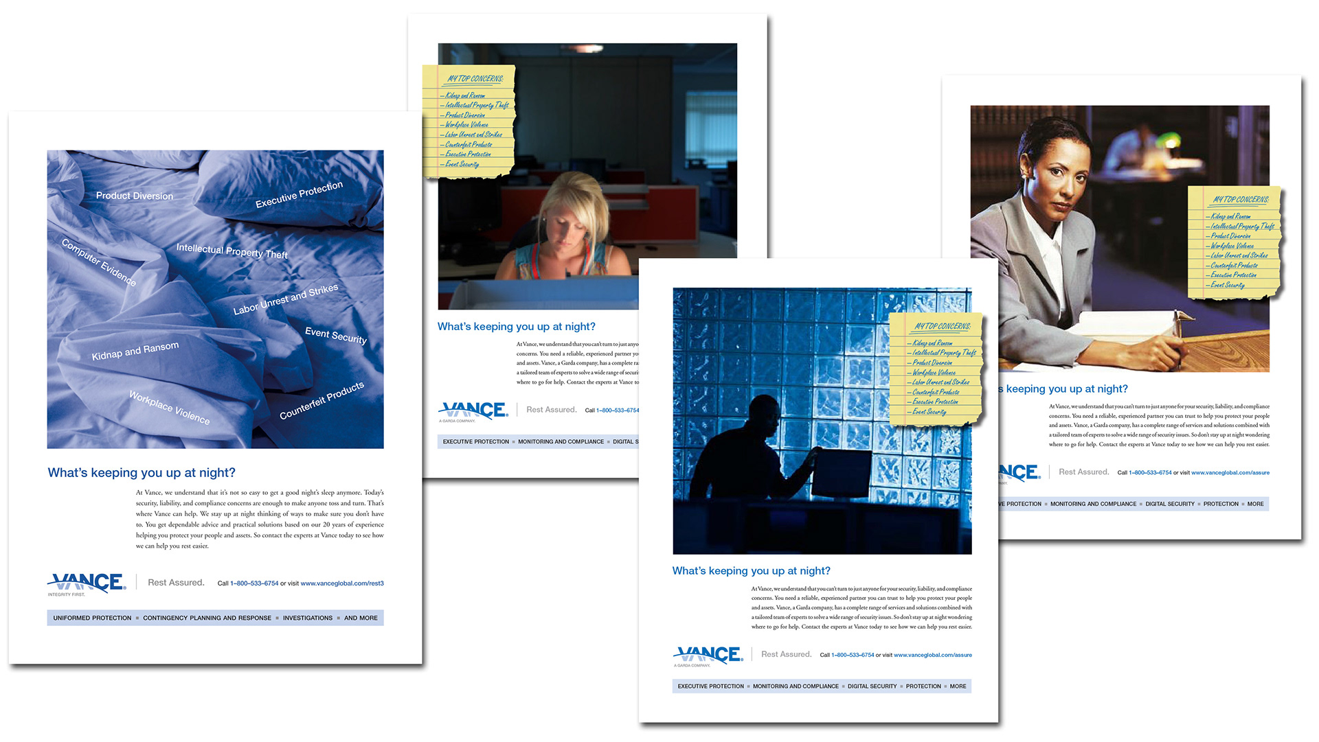
I designed a series of ads to be flexible enough for different audiences. The copy was meant to communicate the message that Vance's security solutions can help you solve what's keeping you up at night.
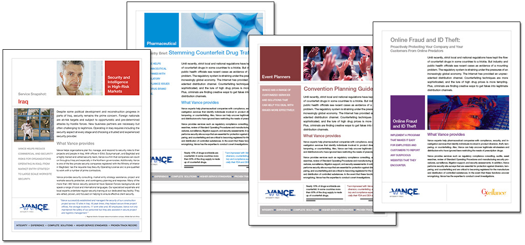
I modified the snapshot templates for various verticals including co-branded collateral.
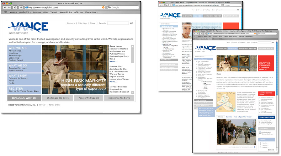
I also modified the design of the website to reflect the various brand extensions.
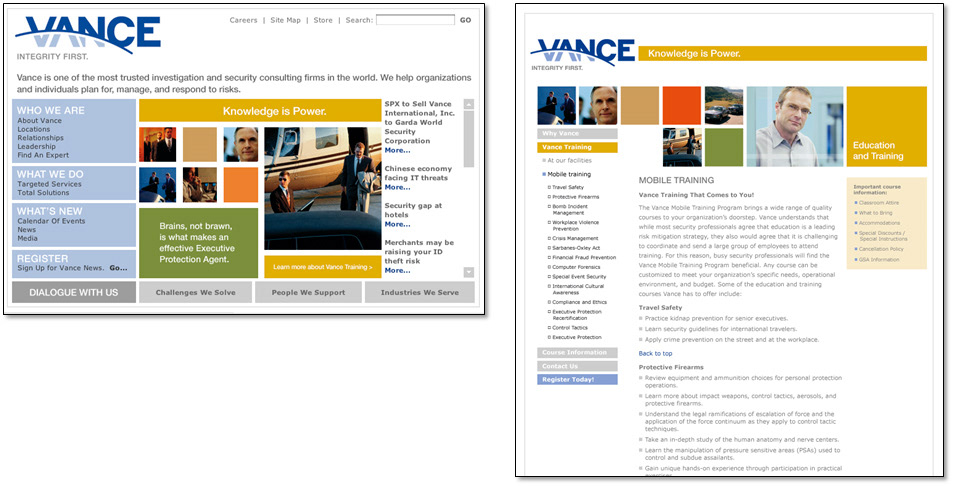
This website modification was designed to promote Vance's training services.
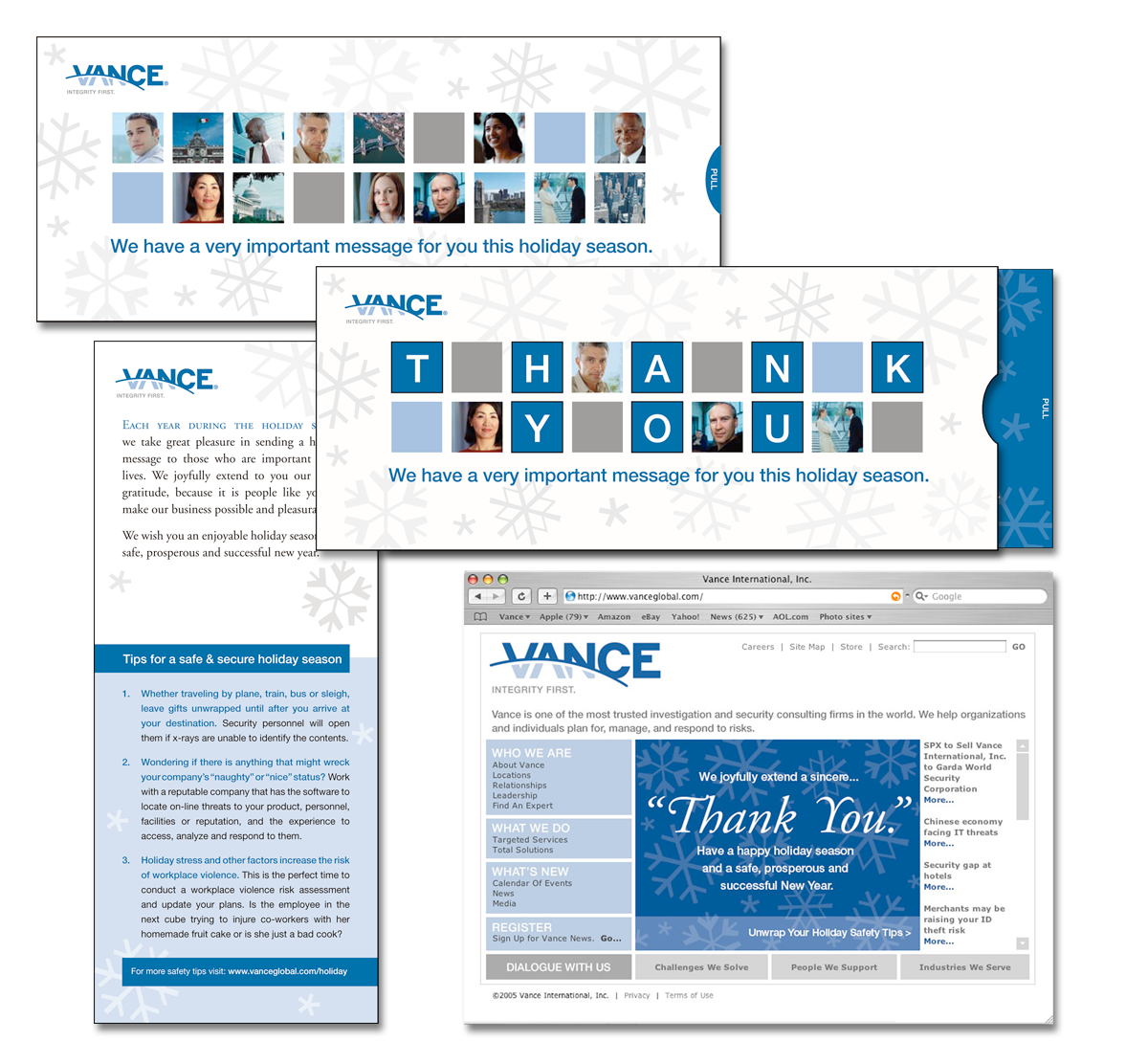
The Vance holiday card I designed featured a diecut window that, when the tab was pulled, revealed a message of thanks to their customers. The card was included in the GDUSA American In-house Design Awards.
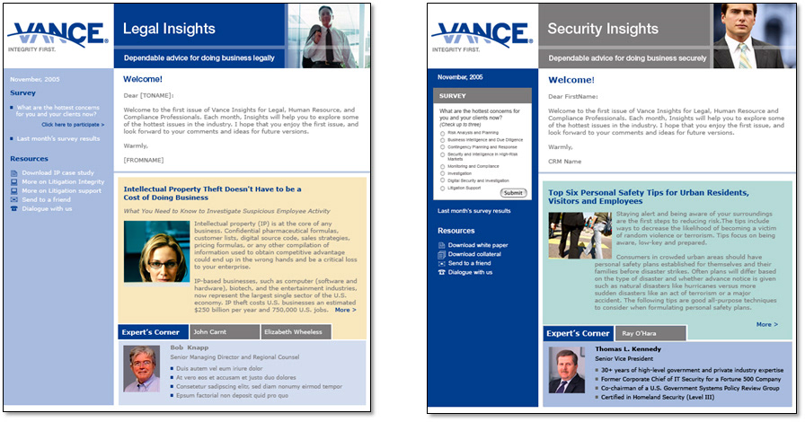
I applied the new brand to Vance's customer enewsletters. These eblasts were also sent to different verticals.
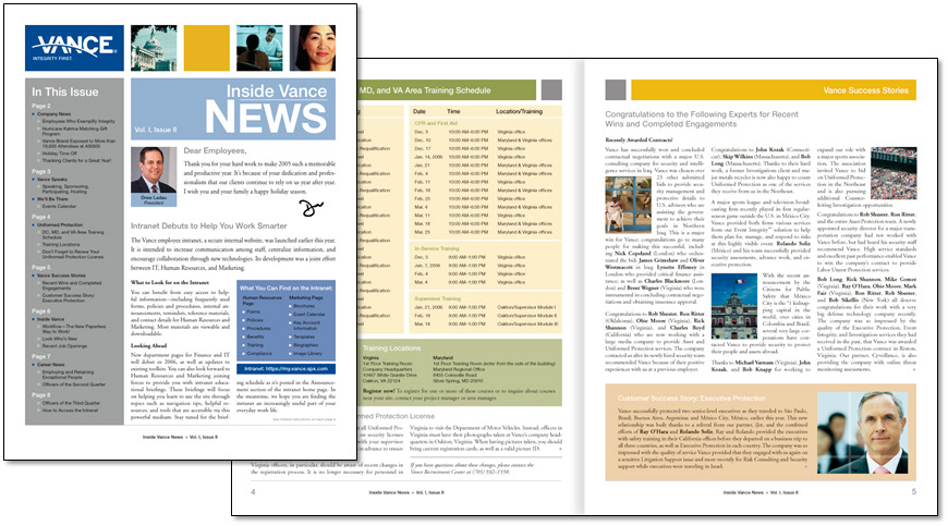
I also designed, and produced, the employee (printed) newsletter.
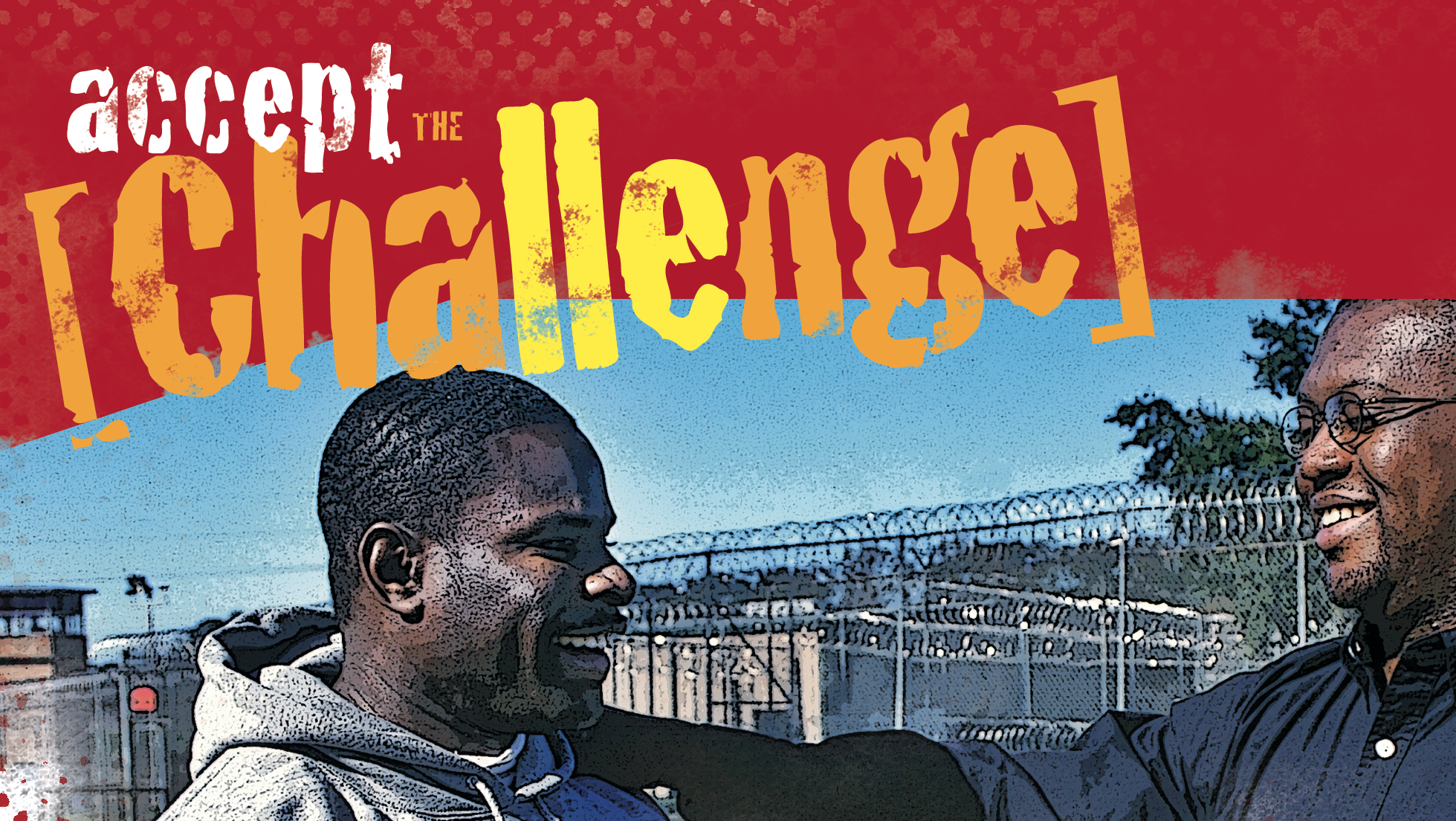
I also designed a series of posters to be displayed at Vance's corporate headquarters to drive interest in the new brand.