Prison Fellowship Ministries’ (PFM) challenge was that their marketing materials, and various program brands, had to appeal to everyone from conservative sponsors and donors to hardened criminals. In order to achieve this I designed a brand that would incorporate different degrees of “edginess” depending on the program brand and audience.
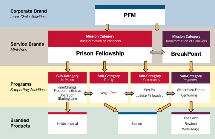
PFM, as an organization, is represented by four key tiers in the brand hierarchy. The PFM corporate brand represents their mission and visually communicates the name of the organization. In addition, it helps define the vision and establish the values of the entire organization. As the top-level corporate brand, PFM also serves as the “umbrella” brand for all the service and program-level brands beneath it. The next level in the brand hierarchy is the service brands: BreakPoint and Prison Fellowship. Although the way they achieve their goals are very different, they both share the same purpose. They are designed to carry out the mission of the corporate brand, fulfilling the vision and exemplifying its core values.
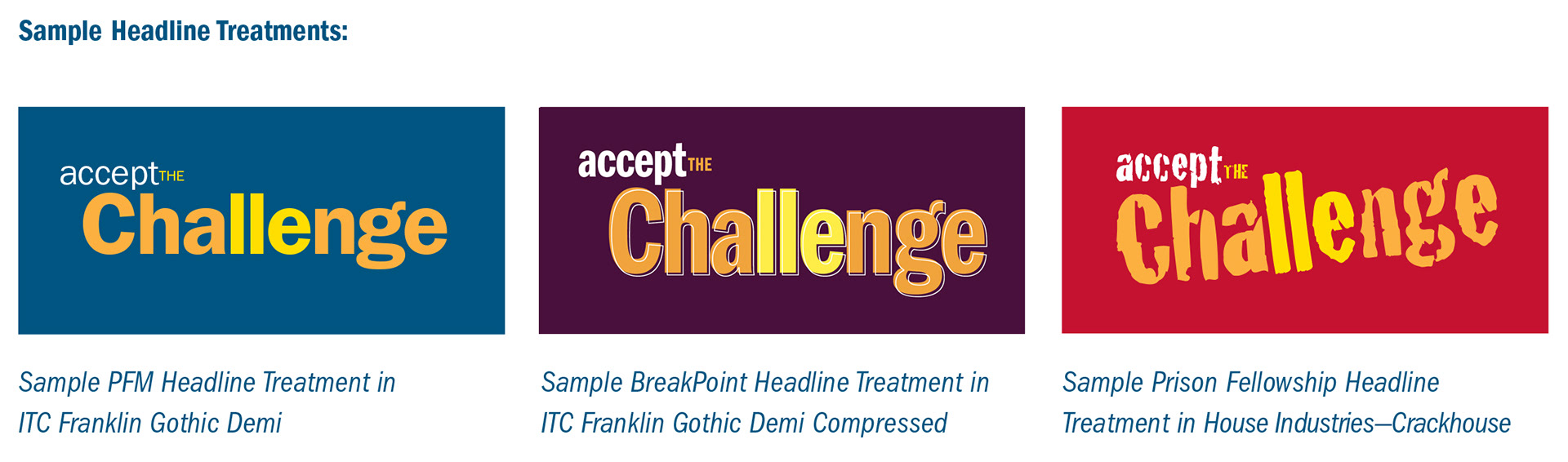
The PFM font family is designed to provide consistency across all the brands. It is based on using a combination of ITC Franklin Gothic (primarily for headlines and subheads) and Slimbach (primarily for body copy). Each service brand uses a different style of the font to provide distinction and edginess. Program brands follow the font family of their parent service brand (e.g., Angel Tree follows Prison Fellowship's use of House Industries’ Crackhouse [yes, that’s really it’s name]). Note how the word "change" is subtly reinforced through the use of color in these headlines.
While brand unity is an important core component of the design, different degrees of visual “edginess” have been applied to each brand. This helps to differentiate each brand and enables them to reach their target audiences more effectively. It is important that each brand maintains a unique look and feel that effectively communicates to its specific audience while keeping a consistent brand that unifies the organization as a whole.
PFM maintains the most corporate and conservative look and feel. BreakPoint takes a step toward a somewhat more edgy feel through its use of typography and textures. Because Prison Fellowship reflects a ministry that is seen as more urban, its style is the edgiest of the brands. These degrees of edginess will be applied to the program- and branded product-level brands as appropriate but should always be derived from the parent service brand.
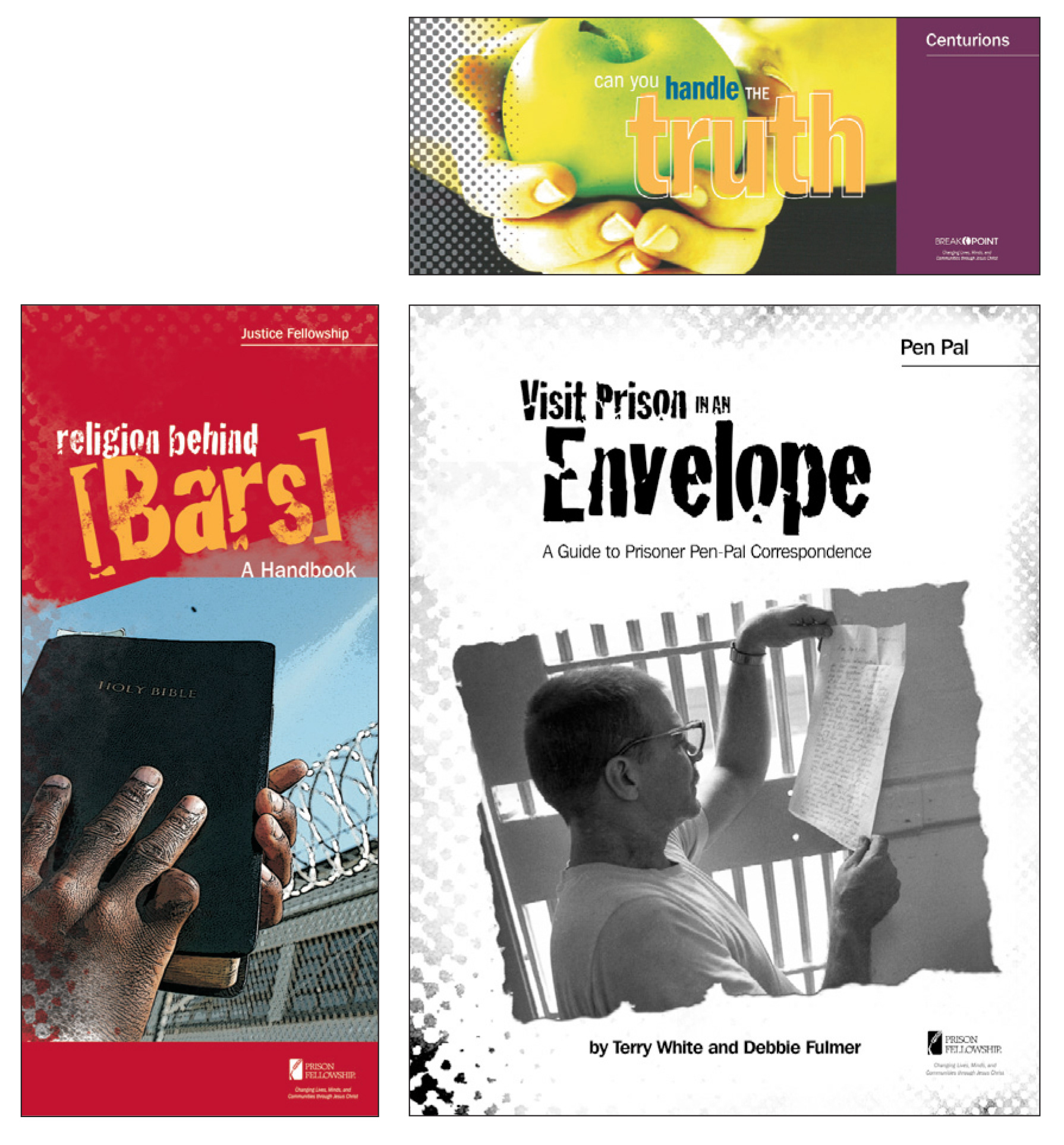
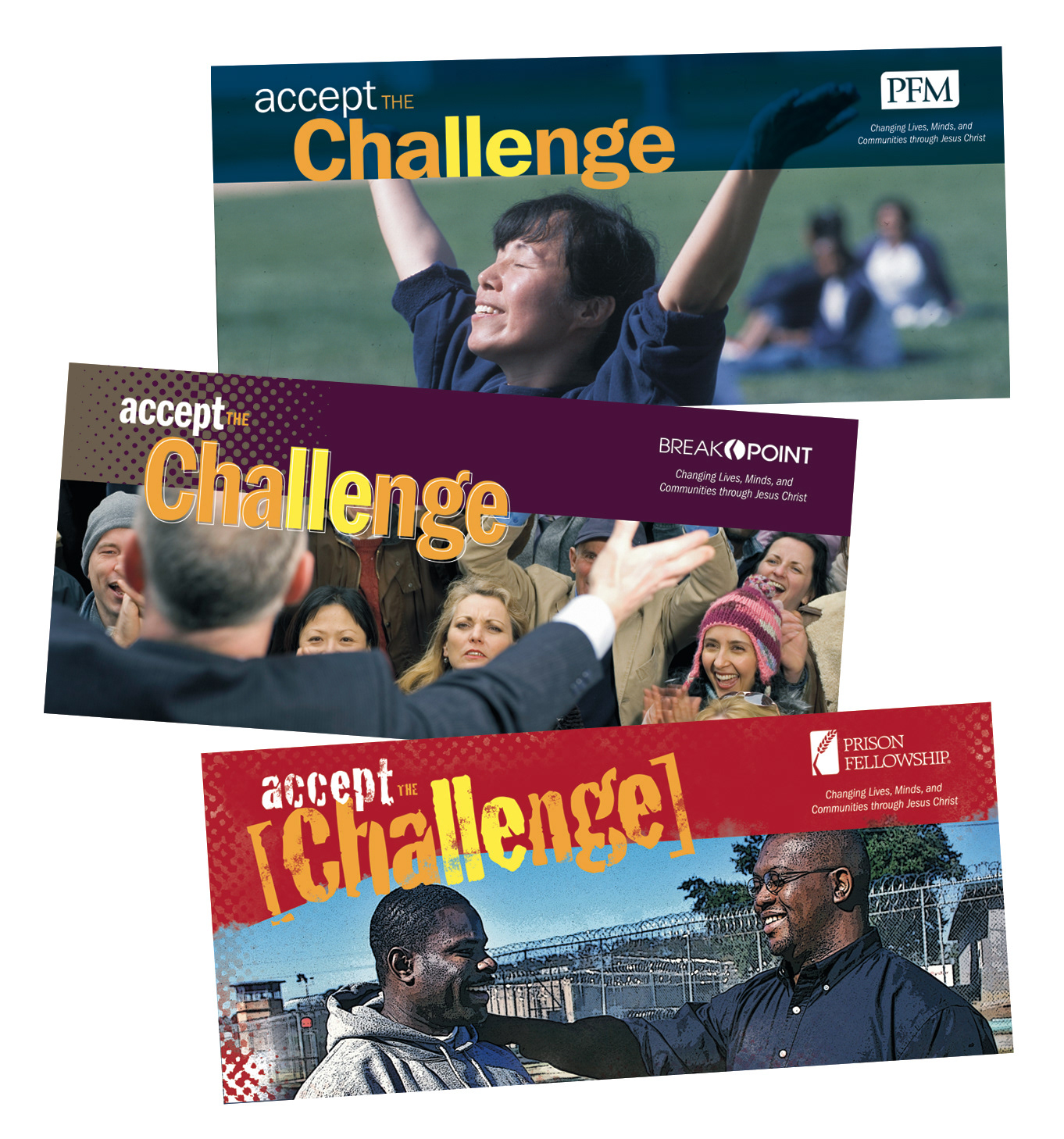
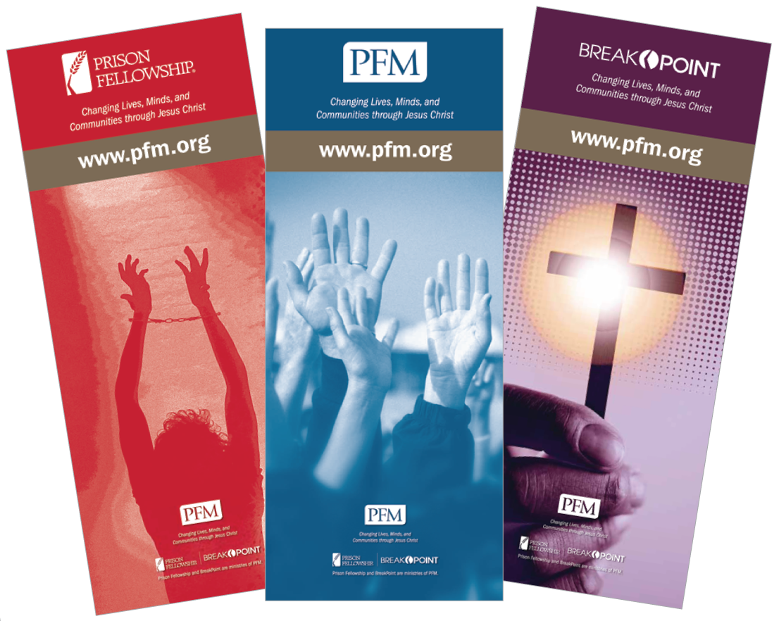
PFM collateral material can come in many shapes and sizes, and the samples above provide just a few examples. You can see in these samples how the type treatments of the program names are handled and the relationship between them and their respective service-brand logos. The type treatment of the headlines, the use of textures and colors all derive from their parent service brand.
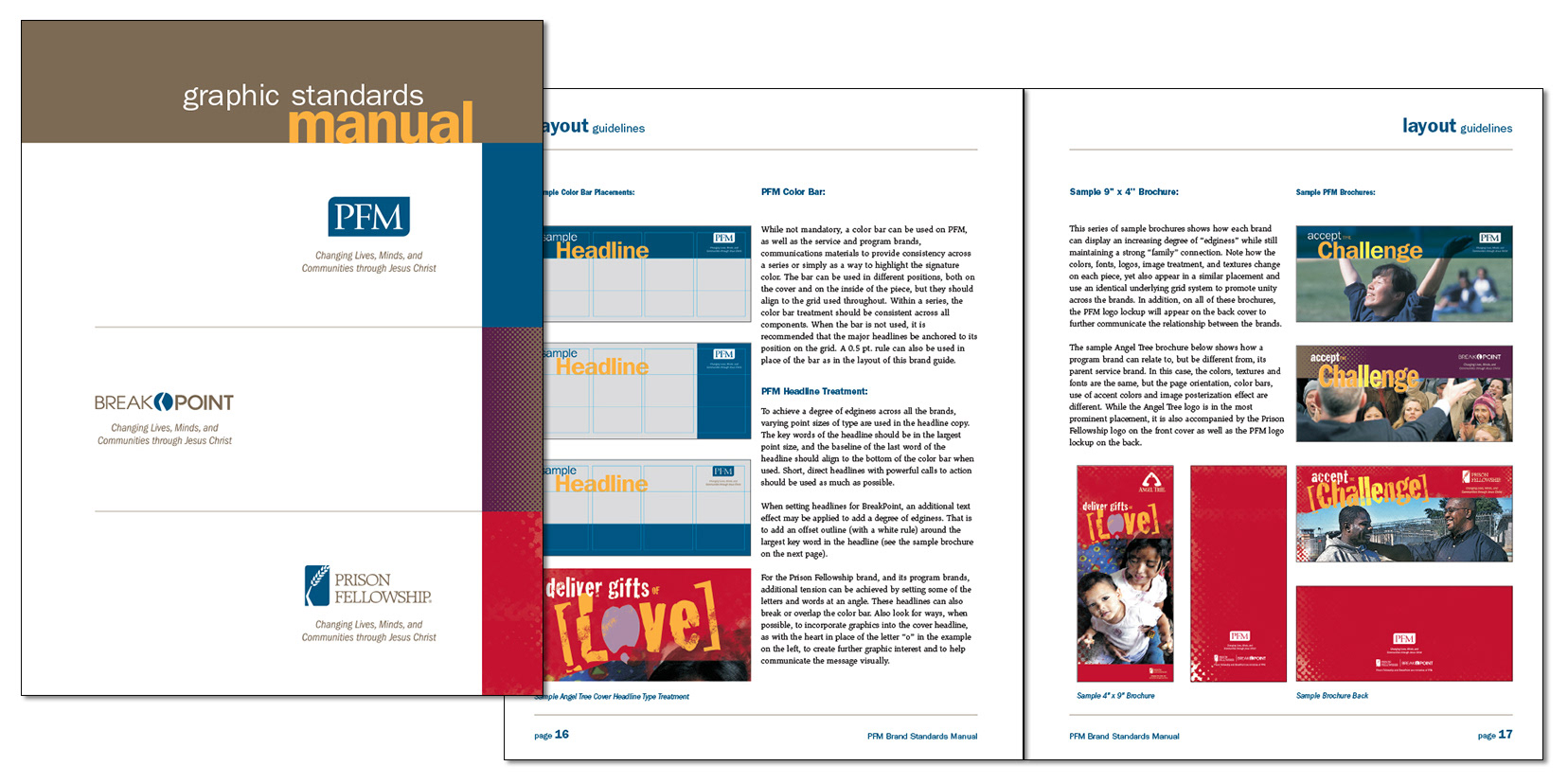
Finally, I wrote and designed a graphic standards manual that explains the use of the new brand hierarchy, taglines, image manipulation, and logos to serve as a useful and informative tool for all PFM employees.
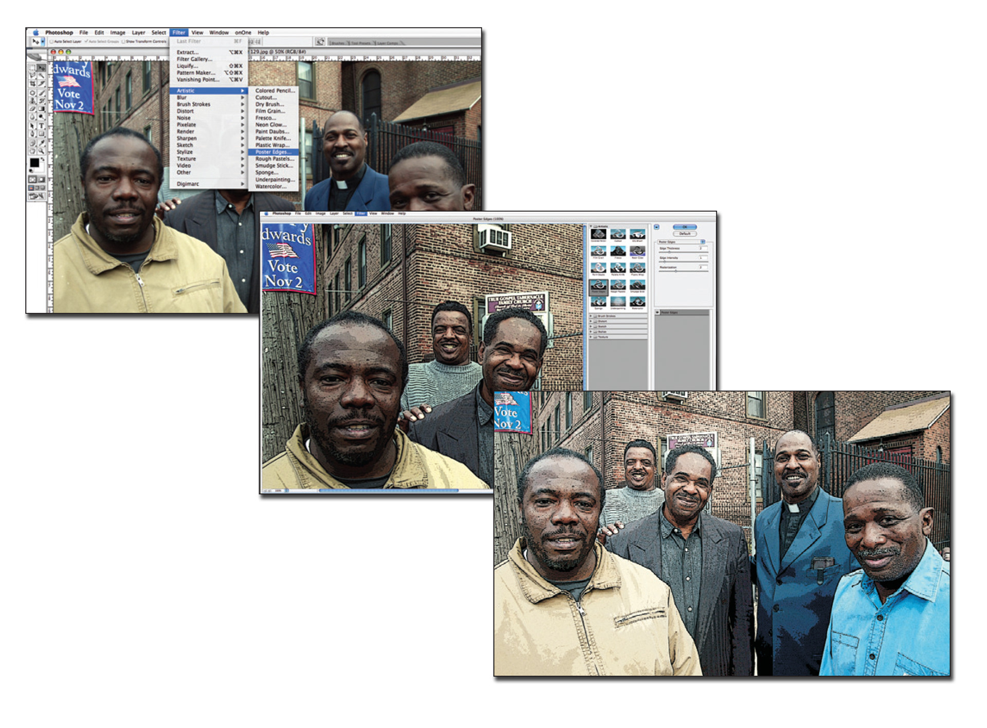
To help increase the degree of “edginess” when using images for Prison Fellowship, a posterization effect can be applied to give the photos a grittier, more urban appearance. Achieving this effect will require a working knowledge of Adobe Photoshop, but otherwise it is a fairly simple process.